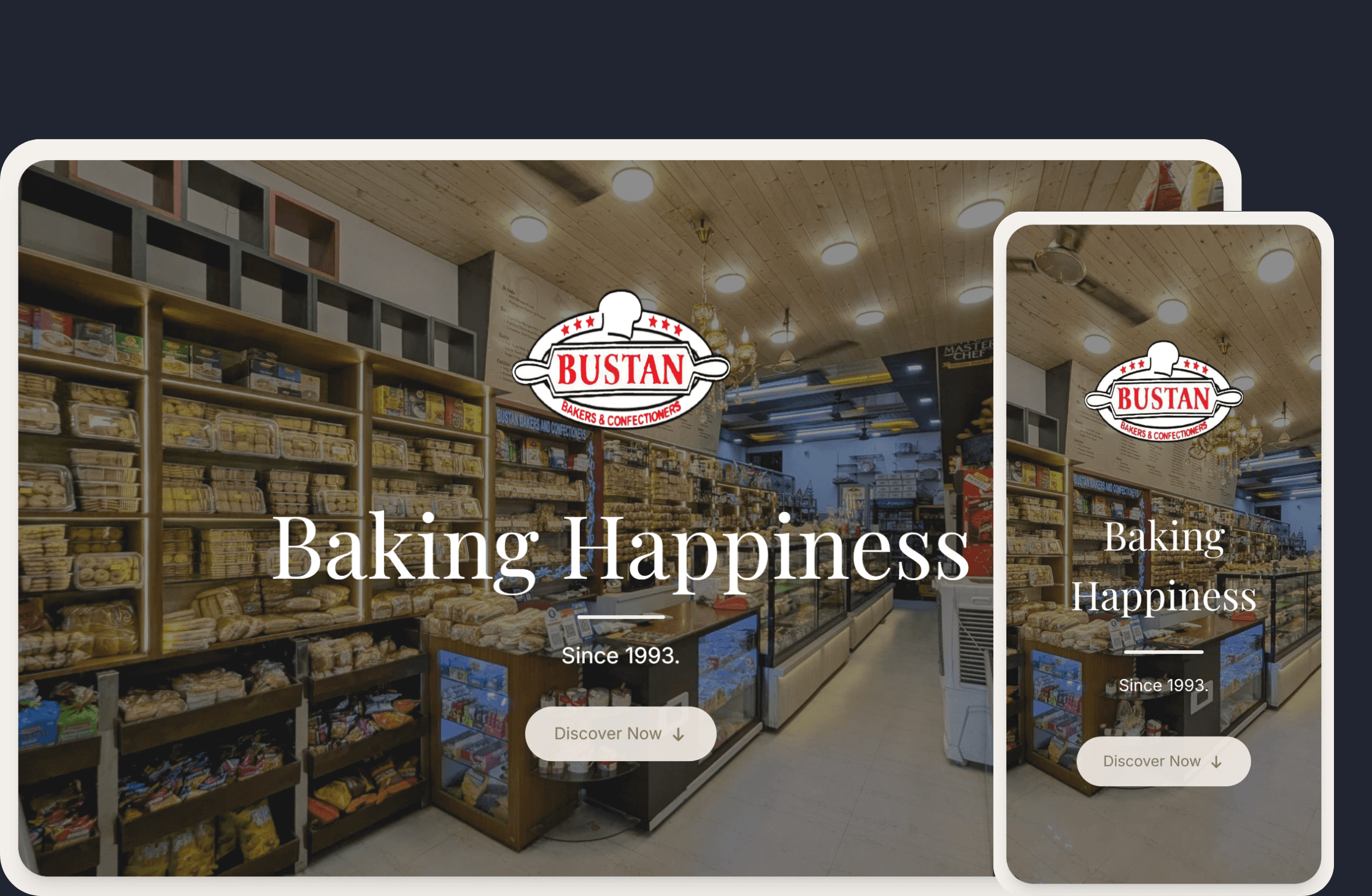
A landing site for a bakery, built in React and Tailwind, whose main job is to get out of the way of the product photography and still feel like the shop.
Problem
A bakery website is a strange brief. The actual product is perishable, local and sensory, and the website can deliver none of that. What it can do is look like the room smells - which is a typography and colour problem before it is an imagery problem.
The other constraint is that nobody visits a bakery site to browse. They are checking whether you are open, what you have, and how to order. So the site has to feel warm while behaving like a directory.
What it does
Product showcase by category, a short brand story, opening hours and location, and contact and ordering routes reachable without scrolling past a fold.
How it's built
React with Tailwind, and Motion for the entrance and scroll animations. The motion design is the deliberate decision here: reveals are short, staggered by row rather than by element, and every animation is on opacity and a small vertical offset, because anything with scale or rotation competes with the photographs. Under prefers-reduced-motion the entrance animations collapse to a fade.
Colour does most of the emotional work - a warm base palette with a deep roast brown as the anchor, which lets the photography stay saturated without the page getting loud. Type pairing is a display face carrying the brand name and a plain text face carrying everything a customer actually reads, because the menu is not a place for personality.
Status
Live at bustanbakers.com. Static, no CMS - the owner updates content through a small set of data files, which is the right amount of system for a menu that changes seasonally rather than daily.
Credits
- The Bustan Bakers team, for the photography
- The Tailwind CSS and Motion communities